With a means of communication as visual as fashion is, color does not receive all the respect it deserves. And the choice of colors we wish to wear is not only a question of esthetics, of pretty colors and ugly ones, but of the significance of those colors and the meaning hidden behind them. Some are defined by the tone that they produce, others might symbolize feelings such as warmth and passion, as with red, or cold and calm blue.
Alejandro Robledo on the Color of Masculinity (video in Spanish)
But the meanings evolve over time, adapting to the historical circumstances surrounding the use or production of these colors, as with purple, which becomes a symbol of royalty due to the complexity of producing the color and is reserved for luxury garments of the highest authorities. These meanings have changed with time and their inheritance directly affects the world of fashion in this day and age.
At the beginning of beginning of the 19th century in Western Europe, after the French Revolution and resulting wars across Europe, society found itself in a period of excess among the wealthy and the nobility, with a plethora of adornments and colors in male and female wardrobes. Men, responsible for working and business, reduced the ostentatious nature of their clothes over time so as not to recreate the dischord that culminated in the Revolution of 1789. The desire to call less attention to oneself prevailed and adornments and embroidery were phased out, along with color. Frugal colors such as black, blue and brown, allowing the wearer to pass unnoticed among the tones of the city, imitating the colors commonly found among the working classes. Flashiness and luxury in clothes was reserved for women, who were transformed into exhibitors of the accomplishments of their husbands: the men made the money and put it on display threw the jewelry and clothing of their spouses, to show off to the rest of society.
This might sound like another history lesson, from a time long ago but this chromatic separation is still one of the pillars of Western fashion today, although not as strict as before. We live in a world where masculinity and femininity are ideologies liked to men and women respectively, and our ideas of these concepts, despite efforts to change, still draw deeply from the well of centuries past.
Just pop into any shop and look around for the women’s fashion section to be treated to a variety of fabrics and colors, and then compare that to the men’s section. Menswear is much more restrictive when it comes to the shapes and fabrics, and, of course, the use of color. For this reason, muted, and diluted, colors that do not shine or call attention to the wearer: maroon, blue, grey, black, beige, and khaki are the most common ones in men’s wardrobes.
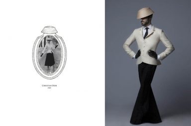
These images are a result of a quick ‘men’s fashion’ search on the Internet. See for yourself that, in general, the men’s color palette is quite a bit more restricted.


And it isn’t right, not only because it deprives men of a greater range of colors, but also because of what this limitation represents and perpetuates, the idea that masculinity limits the development of men by put them in a box of sobriety and seriousness, teaching them to not call attention to themselves with their clothes and esthetics, because that’s what women do. These foundations are so strong that when men dare to take care of their esthetic and add color their wardrobe, society calls into question their masculinity. Of course any man who takes such good care of themselves can’t be much of a man.
There are those who might find this a bit of an exaggeration, and that the use of color is not as important as stated, but is pink not often considered the color of women and blue that of men?

Harry Styles recent tour with a pink suit.
The color of the suit was the subject of many commentaries and was even characterized, in an exaggerated fashion, as a step towards breaking with gender roles.
Just look at this article from Teen Vogue about how revolutionary the act was.
Images courtesy of Alejandro Robledo.
If you like Alejandro’s work and are interested in seeing more, be sure to check out his YouTube channel and Instagram.
Translation and layout by Michael Padilla.